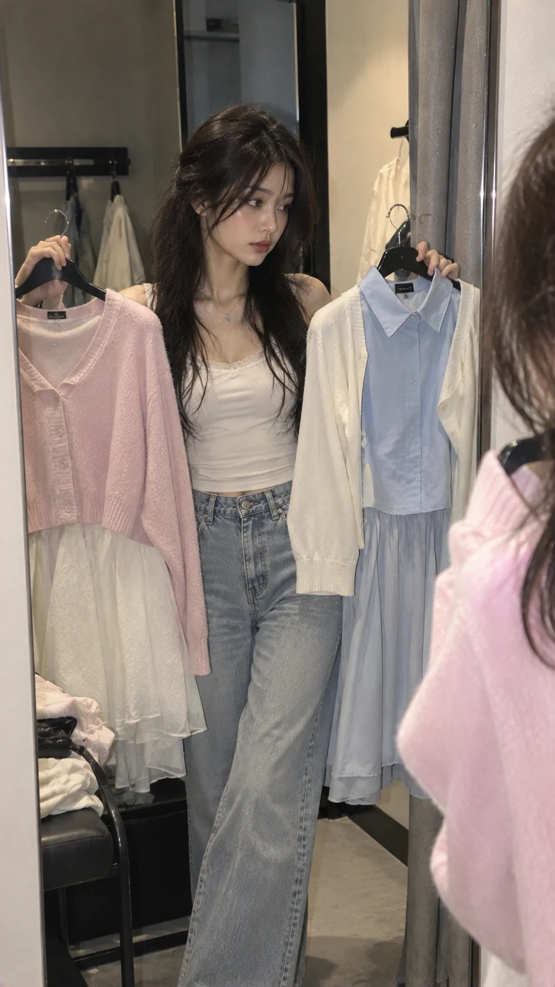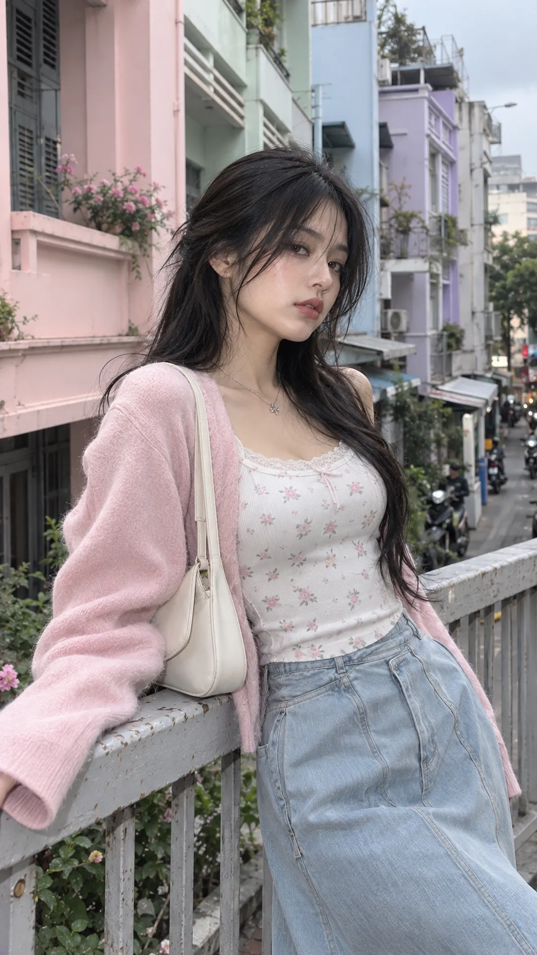
Understand pastels through lightness and intensity
The explanation of tints in Adobe's color guidance describes adding white to make a color lighter and paler, often creating a pastel version. This helps distinguish pale from vivid pink, or pale mint from deep green.
In clothing, pastel does not mean a single color code. Two tops labeled pastel purple can differ in blue, pink and gray undertones. Examine actual fabric or clearly lit photos instead of assuming identical names produce a matching set.
Pastel does not mean every light color either. White has little dominant hue; cream may lean slightly yellow. Cream often supports pastels without needing classification as a specific pastel itself. Light beige and light brown also depend on their actual shades.
Product names such as pastel red or pastel brown require closer inspection: very pale red may read as pink or light coral, while light brown may resemble beige. Sales names aid searches; outfit decisions should follow the color you see.
A pastel palette for planning combinations
The table uses everyday descriptions rather than treating each name as a fixed color standard. Use it to choose a direction, then check your actual top, trousers or bag.
| Color family | Color impression | An easy base to try | Optional accent |
|---|---|---|---|
| Pastel pink | Pale pink, from peachy to slightly purple | Gray, blue denim, cream | A small black or burgundy bag |
| Pastel purple | Pale lilac or lavender | White, charcoal, denim | Silver metal |
| Mint | Pale mint green | Cream, white, light gray | Dark-brown shoes or bag |
| Pastel blue | Pale sky blue | White, navy, dark denim | A small area of black |
| Pastel yellow | Pale, butter-like yellow | Cream, blue denim, gray | Chocolate brown |
| Pastel green | Light, pale green that may lean yellow or blue | Ivory, beige, denim | Deep olive if the shades work |
Pale jade or aqua may sit between green and blue, and mint also varies. Place similar pieces beside white paper in natural light to notice their undertones. An absolute color name is not required before combining them.
The easiest approach: one pastel on a neutral base
A pale-pink top with gray straight-leg trousers is easy to control. The top carries color, the trousers provide a base and white or black shoes set the final contrast. If the bag matches the top, choose minimal detail to avoid excessive repetition.
A pastel-purple top with medium-blue jeans lightens the face area while retaining an everyday base. Try a neat top with wide jeans or a slightly loose one with straight legs. Color cannot do its job if the top hides the waistband and loses the proportions you want.
A mint dress with a cream bag and neutral shoes works when pastel occupies most of the outfit. With that large area, accessories need not introduce another pastel. Small earrings or one metallic detail may finish the look.
If your wardrobe is mostly dark, begin with only a pastel inner top or bag. The approach of one piece with a clear role also appears in the Alt Fashion styling guide for beginners. You can change color while retaining familiar shapes.
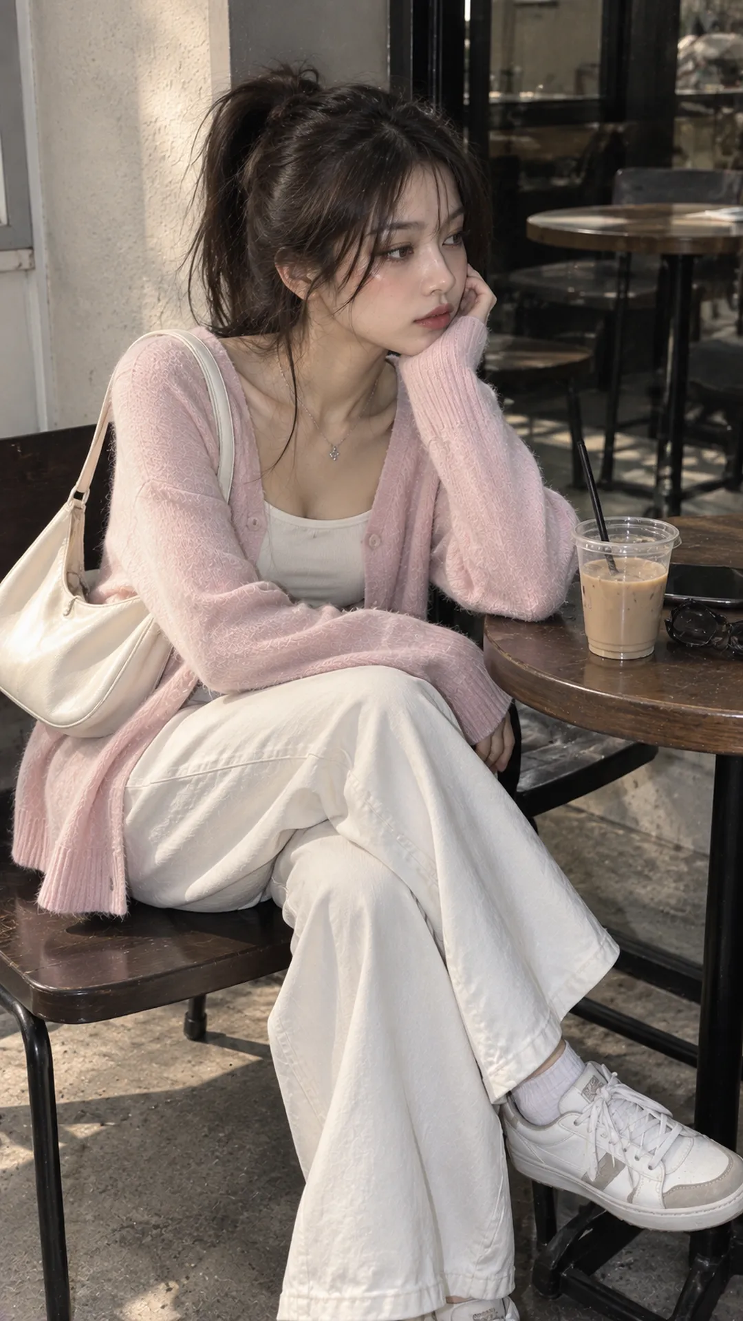
Combine two pastels without losing definition
Two pale colors together can look very soft. To separate them, vary lightness, surface or area. A compact blush top with wide pale-blue trousers gives clearer roles than two equally loose pieces with identical surfaces.
With pastel purple and pale yellow, let one occupy the top or skirt while the other appears only in a bag or small cardigan. A half-and-half split is unnecessary. Unequal areas establish the base and supporting accent.
Pale pink and mint can feel gentle, but check them under your intended lighting. If both are very light and the cuts lack definition, slightly darker neutral shoes create an endpoint. Black is unnecessary if you want to preserve softness.
If uncertain about a pairing, lay top, trousers and shoes on a simple background and photograph them. The method of building a moodboard from color, fit and fabric helps distinguish liking the colors themselves from liking the lighting in a reference.
Pastels and black: adjust contrast
Black can make an adjacent pastel appear lighter. A pale-mint top with black trousers and shoes emphasizes the upper half. For a lighter overall effect, switch to gray trousers or white shoes, keeping black in a small bag.
With a pastel-pink top and black skirt, choose fabric for the desired image. A fine knit and straight skirt feel neat; a large bow and pleated skirt add detail. Cuts can completely change the effect of the same two colors.
Pastel with black does not automatically become Pastel Goth. That aesthetic also involves shape, accessories and other visual cues. For more context, read the differences between Pastel Goth, Cyber Goth and Mall Goth; here, pastel is a broader color group.
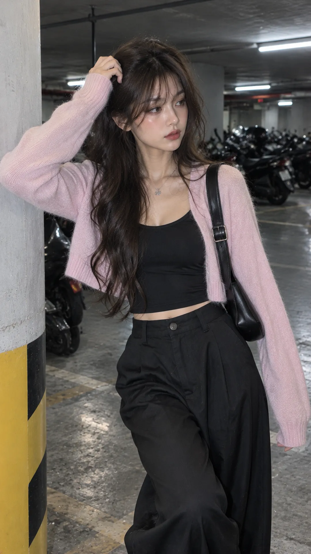
Fabric changes how the same color looks
Matte and glossy pale-pink tops reflect light differently. Do not judge only by matching color names. Shine can become a focal point even in a very pale shade, so use less reflective materials elsewhere.
Ruffles, gathers and multiple fabric layers already add volume to a pastel garment. If trousers also have many pockets, pleats or straps, the outfit can fragment. Let one piece lead in detail and keep another smoother.
With thin clothing, check coverage against a light source and while seated. Light color alone does not establish transparency; inspect fabric construction and lining directly. A white-background product photo is insufficient.
If adding an outer layer, give it a clear function, such as an easily removed cardigan or open shirt. Managing thickness and length in the women's layering guide is more useful than stacking pale colors just to copy a reference.
Three commonly puzzling pairings
What goes with mint?
Start with cream, white or blue denim. Dark brown adds contrast in accessories; pale pink creates softness. If the mint leans strongly blue, compare it with both bright white and cream under real lighting.
What goes with pastel purple?
White gives a light base, gray a gentle transition and black clear contrast. A lilac top, straight jeans and white shoes make a simple everyday formula. For more color, try pale yellow in one small item before combining large areas.
What goes with pastel blue or green?
First establish whether you mean green or blue; the Vietnamese word xanh covers both. Pale sky blue can pair with navy for different lightness levels within one family; pale green can pair with cream or denim. A broad pastel-blue/green label cannot determine a precise match without the fabric.
Adjust pastel outfits that do not match your vision
The outfit looks too pale: add a deep accent in shoes, bag or belt, or change one piece to a more defined fabric. Do not replace the entire palette simply because a photo lacks depth.
There are too many colors: keep one main pastel and make the second piece neutral. To retain several colors, reduce one to an accessory-sized area to create a viewing order.
You dislike the color near your face: try another neckline, adjust your hair or move the pastel to trousers, skirt or bag. No skin tone is barred from the entire family. Placement and area let you adjust without abandoning a preference.
Matching names produced mismatched colors: for a matching set, view both pieces together before deciding. If already mismatched, separate them clearly with a neutral between or use them in different outfits. Pastels are easiest when you choose their relationships deliberately rather than forcing sameness.