

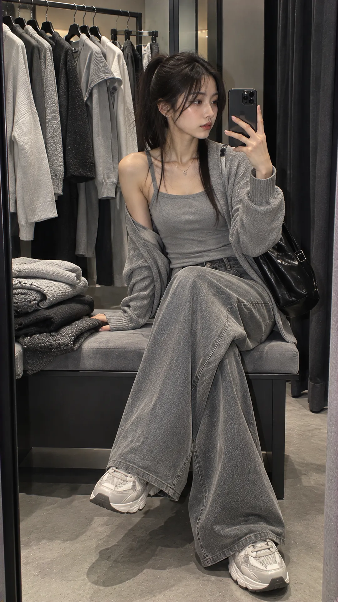
What color is ghi, and does it differ from xám?
The simplest picture is a range between white and black. Light gray approaches white and dark gray approaches black. Clothing sellers often use ghi and xám interchangeably or distinguish choices within their own collections.
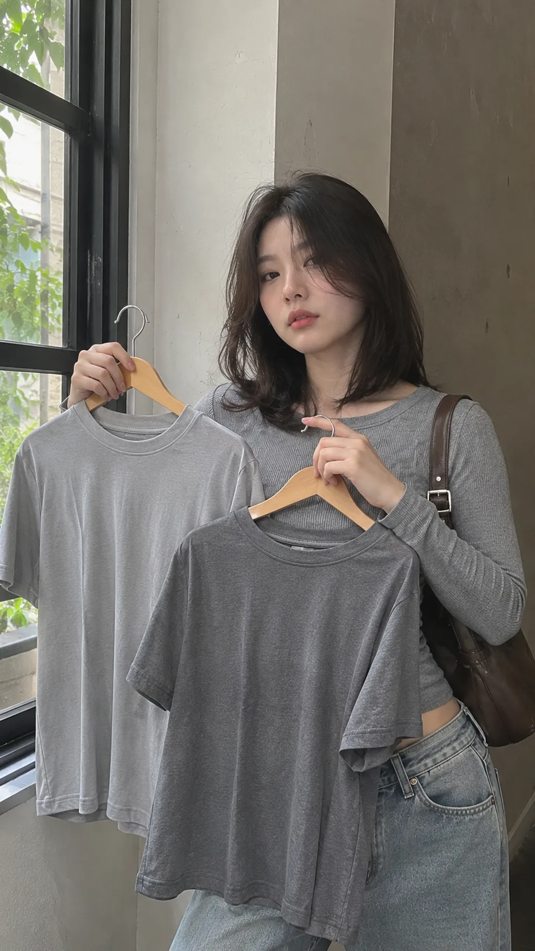
One store might call the light top ghi and the dark one xám, but that classification is not universal. Dark ghi and light xám also appear. Use the complete name, color code and image of the chosen version to identify the right item.
In French, Larousse defines gris as an intermediate color between black and white. A basic definition does not make every clothing gray one swatch. Blue-gray, brown-gray and mixed-fiber fabrics need further description.
When shopping, agree which shade is meant rather than prove someone misnamed it. “Light gray, slight blue undertone, solid surface” communicates better than “real ghi,” particularly with several similar products.
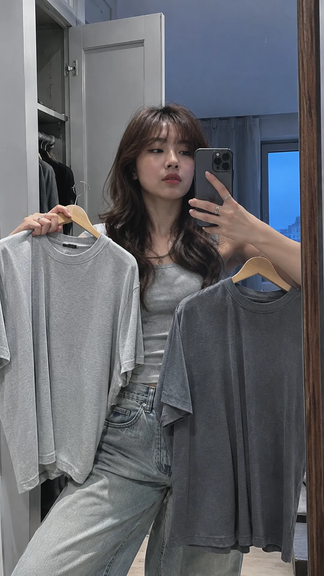
Recognize light, pale and dark gray
Light or pale gray
These usually sit nearer white. An overexposed photograph can make a very light-gray top look white. Inspect a relatively flat torso area beside a white item rather than an illuminated shoulder alone.
Pale sometimes means less intense rather than lighter. If a seller lists both light and pale gray, do not assume equivalence. Request both versions together or ask which is lighter under the same conditions.
Medium and dark gray
Medium gray stands visibly apart from both white and black. Dark gray nears black but remains distinguishable in sufficient light. Faded black can also look gray; product information and actual condition are needed, not photographs alone.
Dark does not mean higher quality, thicker fabric or less visible dirt. Those concern material, construction and use. Thin dark gray can transmit light while thick pale gray remains opaque.
Gray-blue, blue-gray and brown-leaning gray
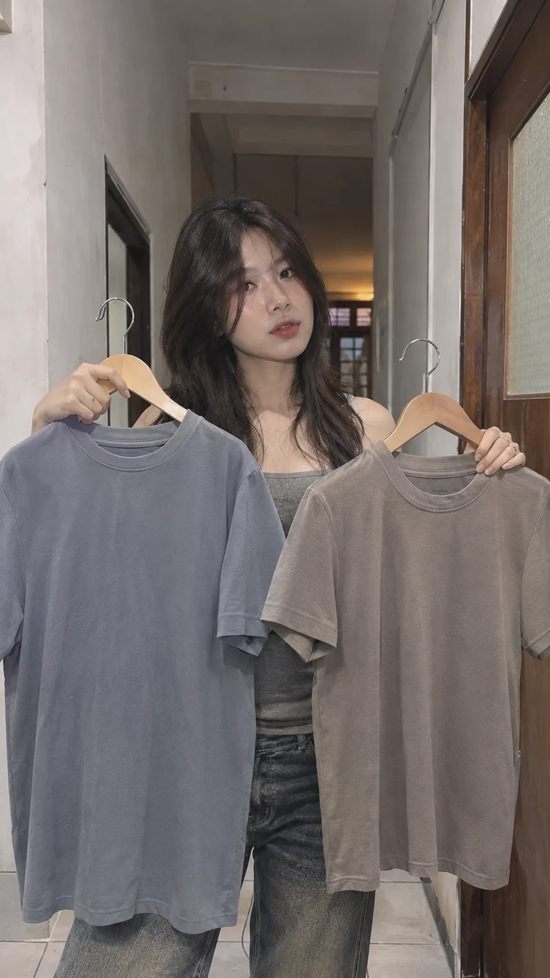
Not every gray-looking garment is free from undertone. It may appear slightly blue, green, purple or brown beside another sample. Subtle undertones can emerge only under certain lighting.
Gray with blue versus blue with gray
Vietnamese ghi xanh generally suggests gray containing some blue or green, while xanh ghi can suggest a blue or green muted by gray. Word order is not a shared industry standard; two shops may use them for nearly identical colors.
If an image looks clearly blue or green, ask which direction it takes. Blue-gray and green-gray can feel quite different beside existing clothes; “does it have xanh?” may not distinguish them.
Brown-leaning gray and greige
Brown-leaning gray often feels less cool beside blue-gray. Greige combines gray and beige, commonly describing gray-beige areas. No fixed code covers the whole group; assess whether the actual sample is nearer beige or gray.
If uncertain, record observations such as “medium-light, little blue, slightly brown.” That supports seller conversations or personal palettes without a concise commercial name.
Stone, lead, silver and mouse-gray names
Material-inspired names evoke an image without forming a uniform cross-brand standard. Stone gray may be medium-light in one product and darker or bluer in another. A brand's own code identifies the exact catalog version.
- Stone gray: suggests stone surfaces or shades, but natural stone varies; inspect the sample.
- Lead gray: often suggests deep gray without guaranteeing equal darkness across products.
- Silver gray: may mean light gray or a glossy effect; ask whether the fabric is metallic or simply named silver.
- Mouse gray: is a familiar descriptive name, not enough to establish an item's undertone and lightness.
If you need a matte gray jacket and see silver grey, do not assume metallic shine. Examine surface close-ups, worn photographs and finishing descriptions. Conversely, a silver-effect item need not resemble solid gray under the same light.
Solid and heather gray: color or surface?
Some sweatshirts or knits show interspersed light and dark fibers or flecks up close, creating overall gray at a distance. Sales descriptions may use salt-and-pepper, heather or mélange; check close-ups because naming varies.
A multitone fiber surface differs from uniform solid gray. Two tops looking equally light in small photographs may differ clearly in hand. This does not establish better quality; it describes your chosen appearance.
Glossy fabric may look almost white in highlights and darker in folds. Nap or raised fibers also change with viewing direction. One sampled image pixel cannot fully describe the top.
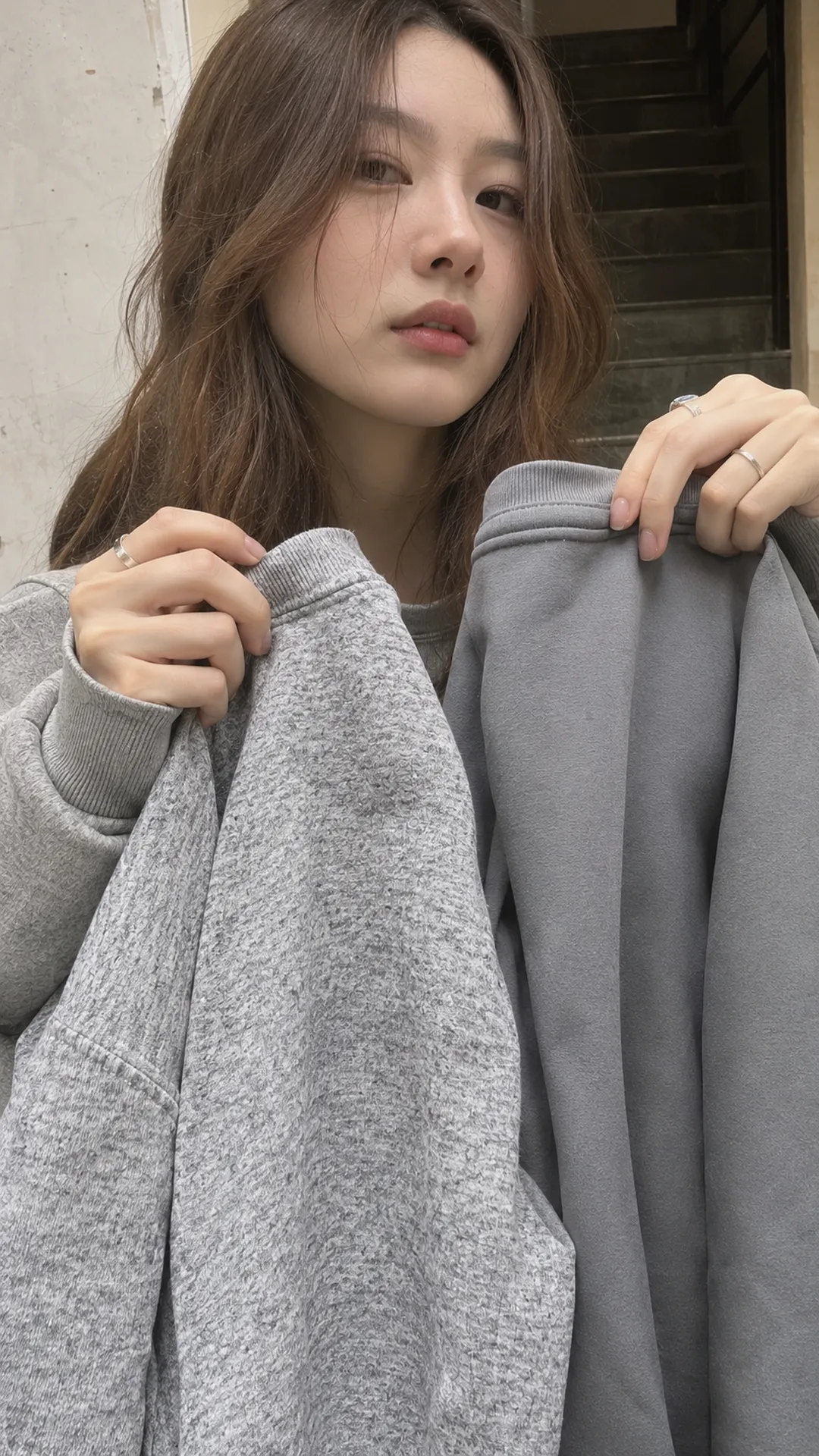
Compare two grays step by step
- Place them together: use garments or swatches under the same light on a quiet background.
- Compare light and dark: inspect flat fabric to identify which is nearer white or black.
- Compare undertones: check whether one shows more blue, brown or purple.
- Compare surfaces: inspect closely for solid color, mixed fibers, gloss or nap.
- Check the intended setting: view indoors and in daylight rather than choosing one photographic angle.
This supports practical decisions, not professional color measurement. For close coordination, such as a matching top and skirt, view both simultaneously. Separate purchases based solely on the word gray can yield mismatches.
Lighting affects color perception. Benjamin Moore's gray guide also discusses undertones and lighting when choosing paint. Clothing additionally requires observing surface and movement; a paint code cannot replace garment checks.
When saving a fashion mood board, separate light, dark and blue-gray samples if those distinctions matter. One gray swatch can erase the very difference attracting you to a garment.
Is gray always #808080?
No. Canva uses #808080 for gray in digital palettes, with equal RGB components of 128. It is one reference, not every light-to-dark clothing gray.
Adobe also distinguishes achromatic gray from near-grays with different color components. In shopping, blue-gray and brown-gray should not be collapsed into one pure-gray sample. Related names do not establish identity.
Editing, warm screen settings or colored lighting can make code comparisons unreliable. Codes can record a design idea; actual images and swatches are better for choosing goods.
What to ask when buying gray online?
A clear message might be: “I want this light-gray code. Could you photograph it beside the dark-gray version under the same light, plus a surface close-up?” That identifies shade and visible structure rather than demanding perfectly accurate screen color.
For matching existing clothes, send a reference and state whether you want close color or a light-dark difference. Differences can help clarify layers; for lengths and thickness, explore the women's layering guide.
Do not let color replace fit. A correctly gray top with unsuitable shoulders may remain unusable. Check measurements through the online sizing guide before ordering, especially without fitting.
Gray also does not determine style. The same shade can look very different through cuts and accessories. For a personal wardrobe, explore starting with Alt Fashion after identifying the color you own.
Frequently asked questions
Is ghi always lighter than xám?
No general rule exists. Check full names, product codes and actual swatches. One seller's distinction may differ from another's.
Is blue-gray simply a badly photographed gray?
Not necessarily. A product may genuinely have that undertone or lighting may affect the image. More photographs under shared conditions or direct viewing help distinguish the possibilities.
Does light gray suit everyone?
Try any gray you enjoy. For tops near the face, compare several under the same light to choose your preferred effect. Skin color should not forbid someone light or dark gray.
Why do two gray pieces still look mismatched?
They may differ in lightness, undertone or surface. Check those separately. Compare side by side for close matching; intentional differences can also create depth.