

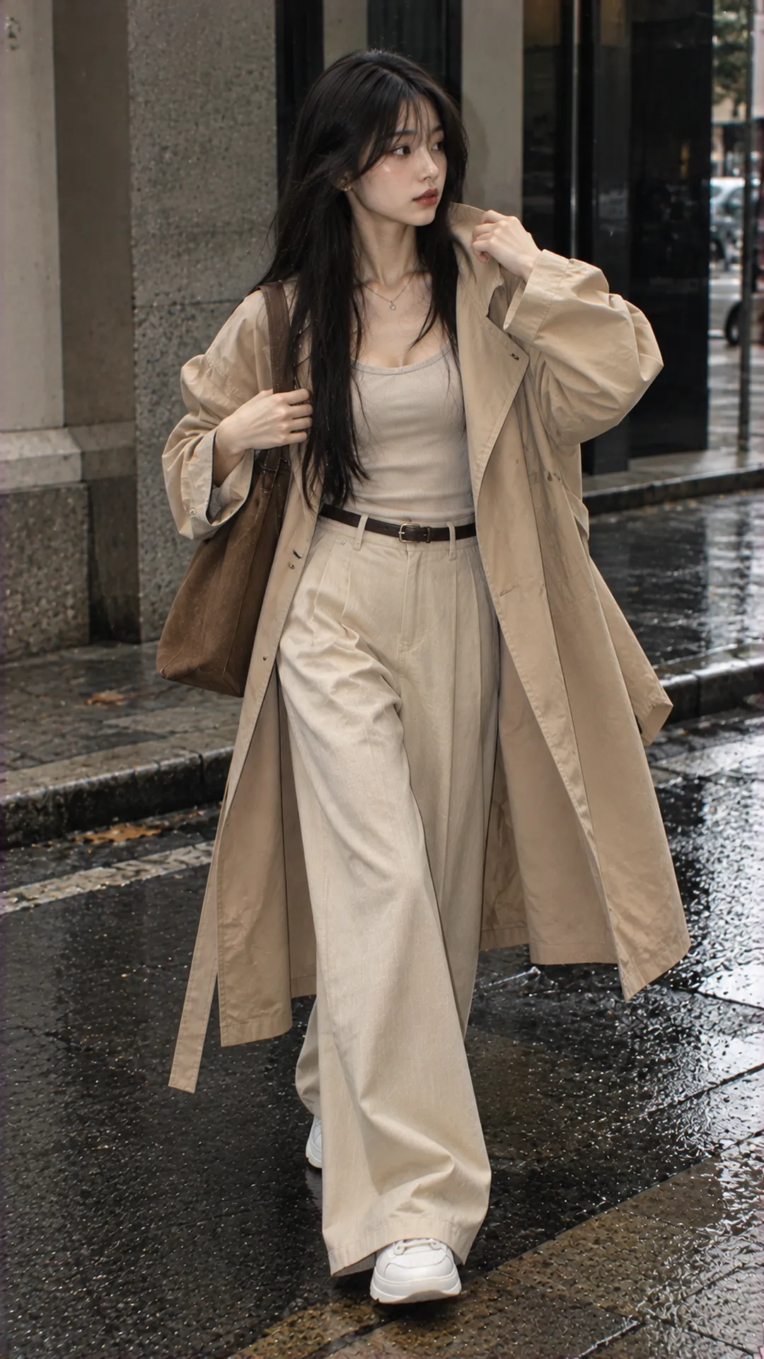
What does beige look like?
Picture beige around pale brown, muted pale yellow and light gray-brown. It is generally less vivid than lemon yellow, less clearly white than paper and shallower than chocolate brown. This is comparative identification, not a compulsory mixing formula for every fabric.
The American Heritage Dictionary describes beige across pale grayish brown, yellowish brown and grayish yellow. One word can therefore evoke several close samples. A swatch and a product-specific color code help more than debating whether a top is beige enough.
Beige is called neutral in styling because it often provides a quiet foundation for other pieces. That does not mean it has no hue. Yellow beige still leans yellow; pink and gray beige still differ despite low intensity.
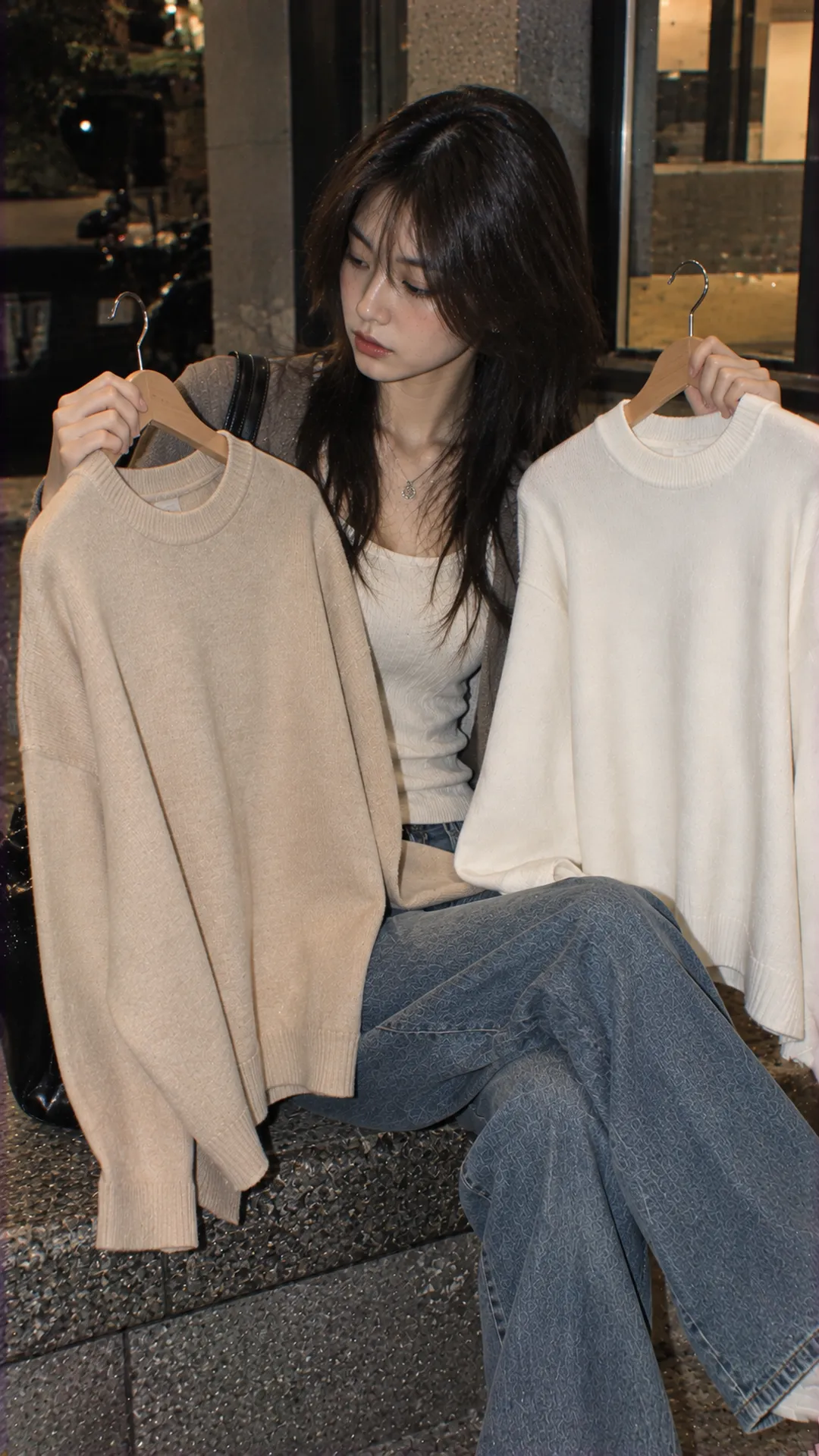
Recognize light, yellow, pink and gray beige
Read lightness first
Compare a top with familiar white and brown pieces. Near-white fabric with a slight yellow-brown cast can be described as light or pale beige. For something deeper and closer to brown, brown-leaning beige communicates more clearly than “true beige.”
Stores do not always use pale and light consistently: some mean low intensity, others proximity to white. To select a particular version, send a photograph or product code with a description rather than simply requesting a lighter one.
Then examine undertone
Yellow beige shows yellow clearly beside gray beige. Pink beige contains a pink or pink-brown note. Gray beige feels less yellow-warm without becoming pure gray. These descriptions help compare goods rather than define absolutely bounded categories.
Place two tops on a minimally colored background under the same light. Assess the whole, then a flat area free of shadow. Comparing separate store photographs may exaggerate differences caused by lighting.
Beige versus cream, ivory, taupe and nude
- Cream: usually suggests a very light color with soft yellow. Some light beige is close, but not every beige top is cream.
- Ivory: usually sits nearer white with slight warmth. Brands' commercial naming can still vary.
- Light brown: usually reads more clearly brown. Brown-leaning beige overlaps with it.
- Taupe: often covers gray-brown. Some taupe is close to gray beige; other examples are considerably darker.
- Nude: describes colors associated with skin, not one pale beige representing everyone.
For a less-visible underlayer beneath sheer clothing, a nude label is insufficient: try a shade near your own skin under the actual outer garment. Likewise, two items both labeled nude beige are not guaranteed to match.
Do not declare a seller wrong from one image alone. Ask, “Does this lean yellow or gray, and can you photograph it beside white?” A specific product question resolves the need faster than demanding one universal definition.
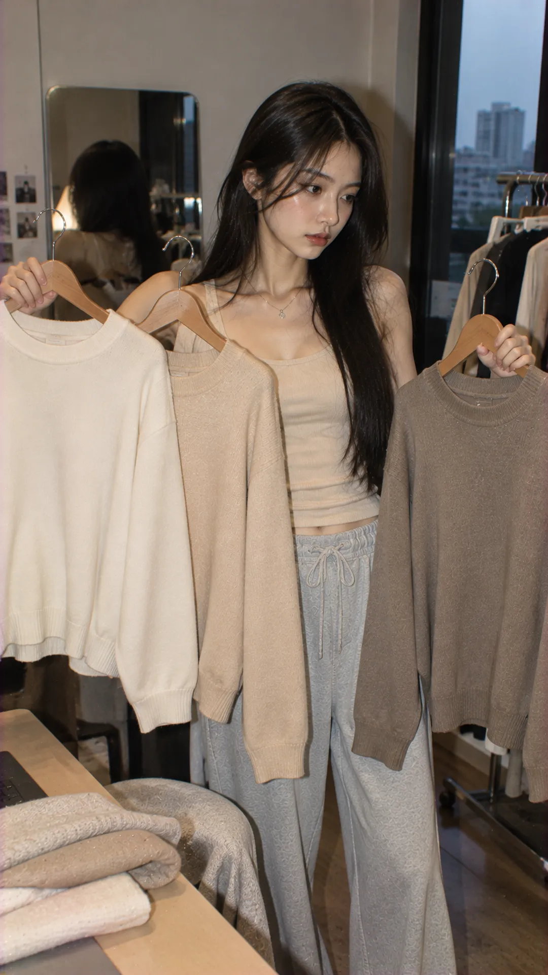
Why #F5F5DC does not describe every beige top
In digital palettes, Canva lists beige as #F5F5DC, corresponding to RGB 245, 245, 220. This helps with design backgrounds or palette notes; it is not a rule requiring every fashion product called beige to match.
Fabric has surface, gloss, folds and its own reflection. Screens also depend on display settings. Sampling one pixel from a listing cannot confirm real garment color, particularly in highlights or shadows.
For a fashion mood board, save both a reference swatch and the actual garment image. “Light yellow-leaning beige, matte surface” guides jacket, bag or shoe choices more clearly than a swatch demanding identical matches.
Check beige under light and across materials
Before concluding that a garment is the wrong color, view it in sufficient light without a strong yellow lamp illuminating it alone. Then inspect it where you normally dress. Learn its real-life appearance rather than finding one angle matching the advertisement.
A matte shirt can show relatively even color, while a shiny dress shifts light and dark across folds. The same beige direction therefore feels different. Multicolored fibers can also look different close up and at a distance.
Check coverage in light clothing too: stand, sit, turn and inspect stretched areas. Beige is not inherently transparent, and fabric names alone cannot establish opacity. Light, thickness, lining and construction need assessment on the item.
An unfiltered short video may add online information without replacing an in-person fitting. If color is essential, check returns and retain the order's color code.
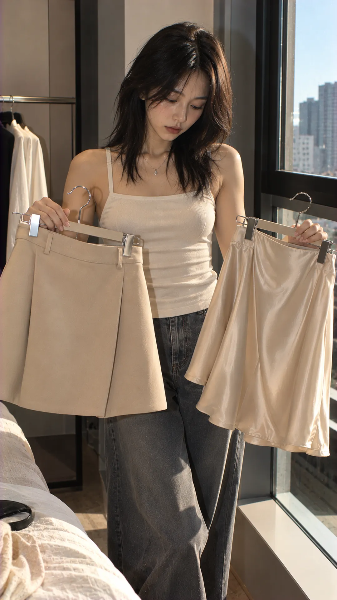
Four ways to use beige without replacing your wardrobe
A beige top with a dark area
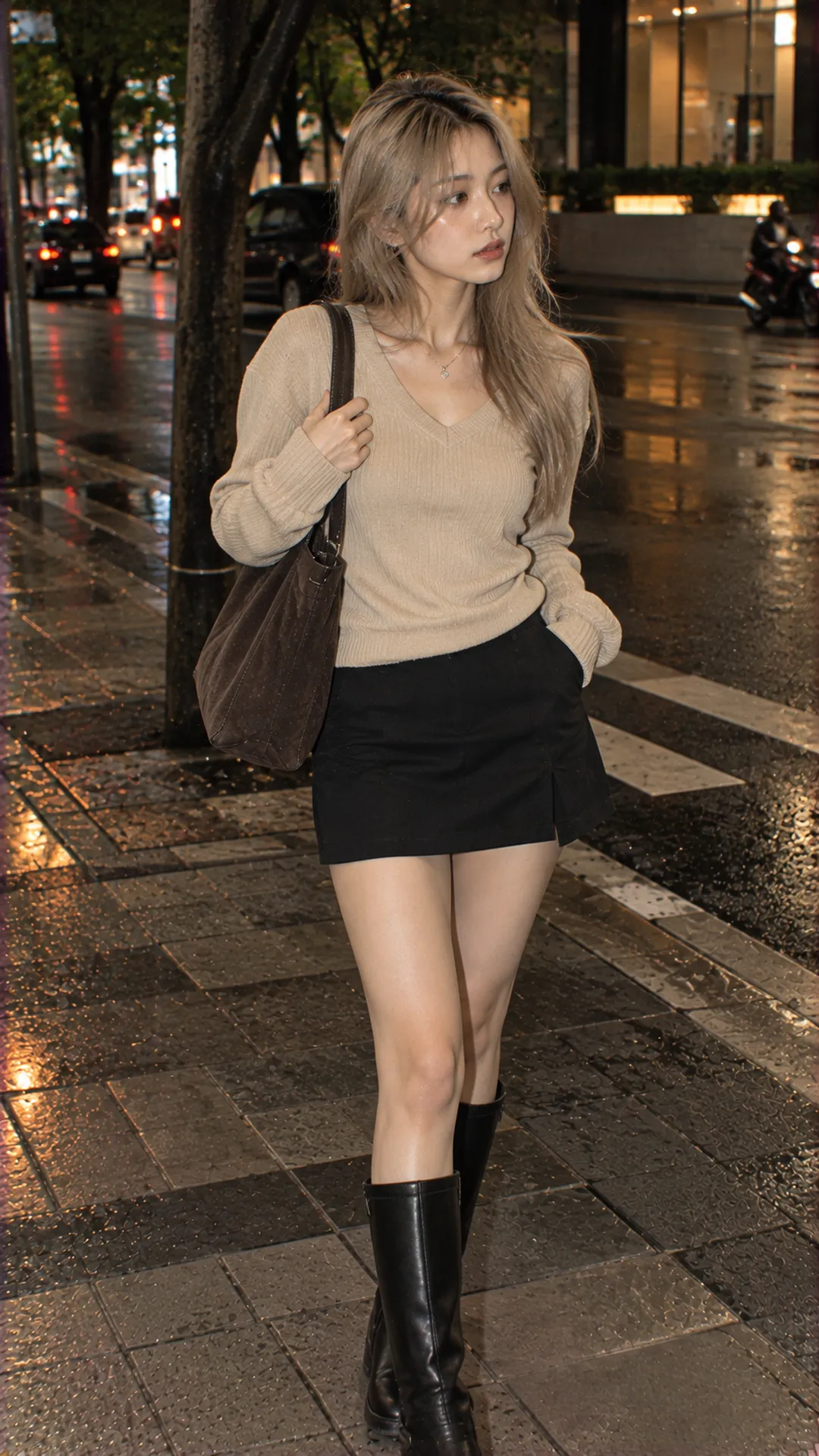
Try light beige with a black skirt and existing shoes. The dark boundary clarifies top shape. If the lower half feels heavy, try visually lighter shoes rather than buying a new color.
A beige dress with a brown jacket
Choose different lightness levels so jacket and dress do not merge completely. With a soft dress, defined jacket shoulders contrast in shape. If both are roomy, check their lengths and endpoints through the women's layering guide.
Beige and blue denim
An open beige shirt over a simple inner top with a denim skirt tests color through familiar clothes. Denim blues vary, so inspect your actual pair. This is an experiment, not a promise of identical effects with every blue.
Beige with a colored accessory
With a beige dress or coat, try a deep-red bag, soft-blue scarf or shoes in a favorite color. Use one accent initially to identify your preference, then increase prints or accessories if desired. Beige need not remain minimalist.
Beige can also enter expressive outfits through substantial shoes, asymmetric cuts or metal accessories. For that direction, start with shape and a main piece in the beginner Alt Fashion guide rather than assuming a new color changes the entire style.
Choose for your needs rather than “skin-flattering” promises
Do not divide wearers into those allowed or forbidden beige. For a top near your face, compare two shades under the same light with similar hair and accompanying clothes. You are assessing a preferred effect, not one answer for all skin tones.
If the outfit lacks definition, change one item's lightness or add a contrasting trim, collar or bag. If you enjoy softness and low contrast, retain it. Pale is a problem only when it conflicts with your intention.
Before paying, check whether the color works with an existing outfit, the material suits the destination and the cut permits movement. High price does not prove a better beige; low price does not establish rapid color deterioration.
Consider budget, reuse and fabric together. The Alt Fashion shopping guide helps assess a purchase beyond an appealing outfit image. For cleaning, follow the specific label rather than one method for everything beige.
Frequently asked questions
Are beige and the Vietnamese name be different?
In ordinary Vietnamese fashion usage, be is a localized name for beige. Visible product differences generally arise from shade, material or brand naming, not whether the label uses English or Vietnamese.
Is beige warm?
Many shades feel warm through yellow or brown undertones. Gray beige can appear quieter and less warm beside yellow beige. Compare actual samples rather than assigning the entire family a temperature while ignoring undertone.
Can I wear all beige?
Yes. Different lightnesses or surfaces can add depth. For very close matching, compare pieces before buying; the same color name from two sellers may still differ markedly.
Why does a received beige top differ from its photograph?
Photography, lighting, editing and screens can all contribute. Compare the correct product and color codes and actual photographs, then contact the seller about significant differences. A screen photograph alone cannot establish the cause.