

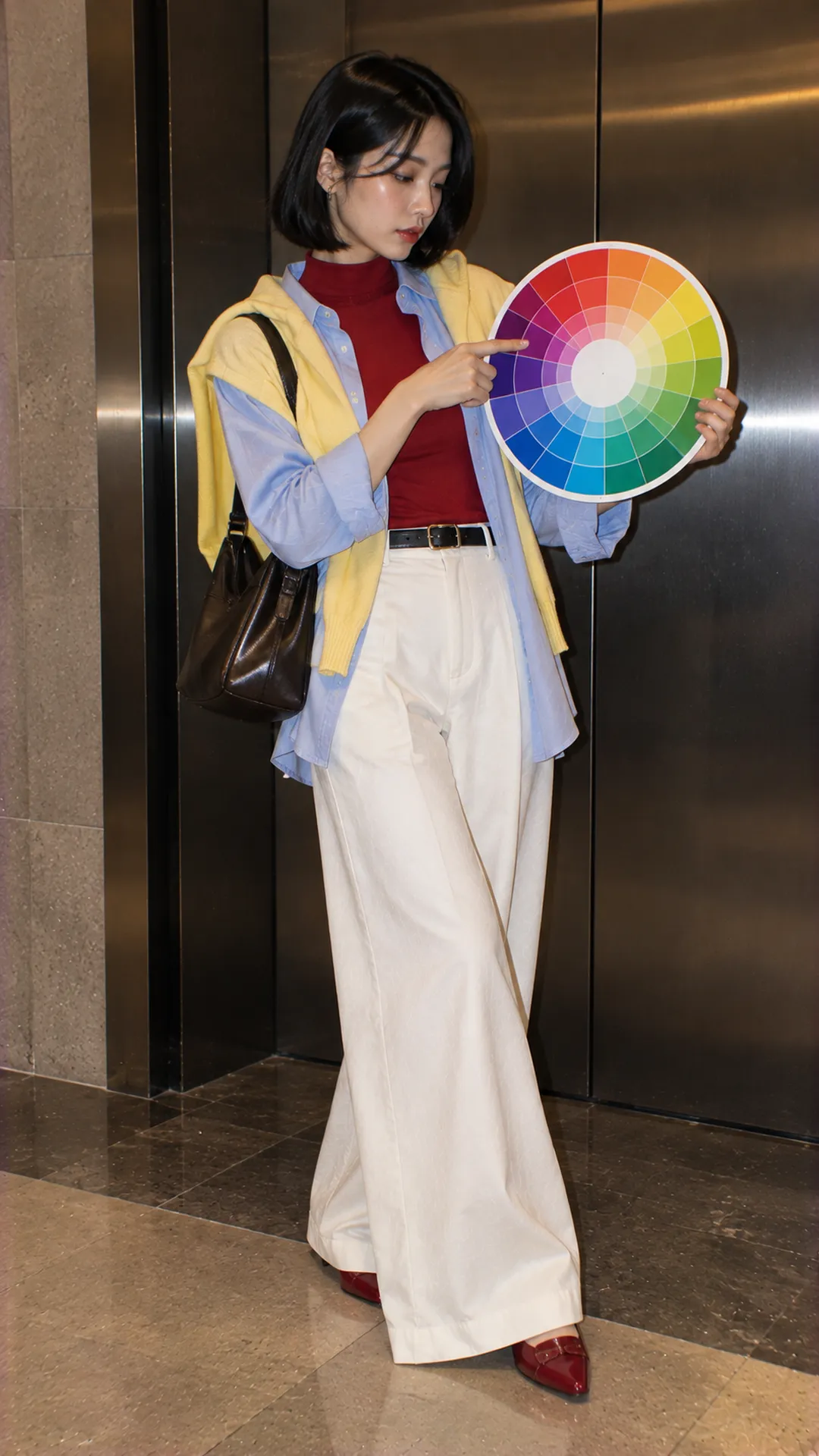
Read the wheel for outfit decisions
Traditional wheels often used in outfit guides arrange red, orange, yellow, green, blue and purple families. Nearby colors create transitions; opposing ones contrast in hue. The guide from VTV on color wheels and clothing uses these relationships to explain basic coordination.
Not every wheel uses the same system. Canva distinguishes RYB and RGB wheels: one commonly explains painting relationships, the other concerns screen-light color. Opposites may therefore differ between tools. Here, pairs such as blue and orange refer to the traditional RYB wheel.
Clothes do not mix into a new color as paints do. You place color areas beside one another. Assess how the eye reads the composition rather than seeking an exact dye-mixing formula.
Three qualities to assess before choosing pairs
Hue: which family does the item belong to?
Start with the nearest family: blue, green, red or purple. A purple-leaning blue differs from green-leaning blue even if stores call both blue. If unclear, compare with simple-colored pieces under the same light.
Lightness: how light or dark is it?
Two blue pieces may differ mainly in lightness. A very light top with very dark trousers clearly separates the halves. For continuity, try closer values; for distinguishable layers, increase the difference in one intentional place.
Intensity: strong and clear, or muted?
Compare bright orange with earthy orange: the hue direction is similar but visual pull differs. When opposing colors feel harsh, reduce one item's intensity before changing the pair entirely. This often retains the idea in a more wearable form.
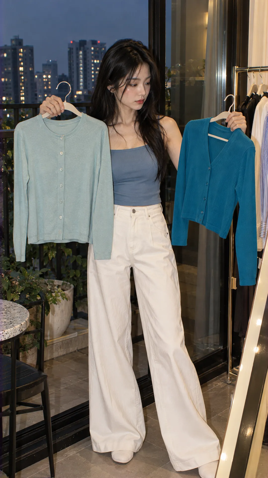
For less contrast: monochromatic or analogous
Monochromatic styling uses one color family with different values or surfaces. A pale blue top, dark-blue trousers and related blue bag connect without exact matches. Vary lightness or combine matte with a defined texture to avoid flatness.
Do not rush to buy simply because existing colors differ slightly. Separate them with an inner layer or change positioning. A dark open jacket over a light top can make the difference intentional instead of forcing almost-matches into one exact-color set.
Analogous styling uses neighboring families. Try turquoise with a muted blue skirt and simple shoes. Let one area lead; you need not use every available blue-green segment on the wheel.
For a layered wardrobe, explore organizing women's clothing layers. Related colors connect layers, but hems, thickness and widths still need clarity. Another same-colored layer does not automatically streamline an outfit.
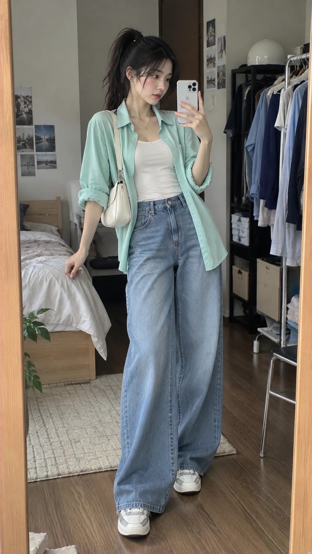
For an accent: complementary and split-complementary
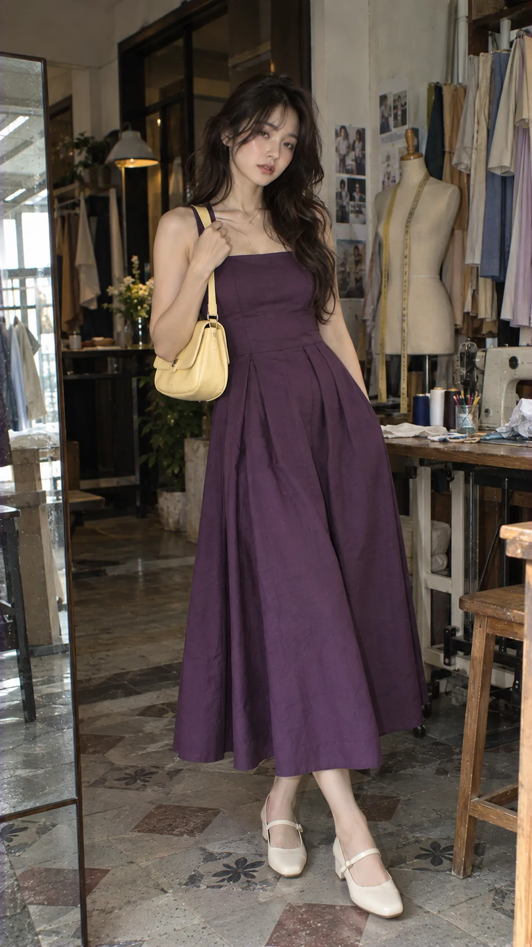
Complementary colors sit opposite on the chosen wheel. In RYB, blue-orange, red-green and yellow-purple are familiar pairs. Instead of equal areas, put one in a top or dress and the other in a bag, scarf or trim.
Try a deep-purple dress with a muted yellow bag and neutral shoes. If the bag attracts too much attention, use a less intense yellow or a smaller item. These are separate adjustments: color versus area.
Split-complementary uses a main color and the two neighbors of its opposite. Adobe explains this separately from evenly spaced triadic colors. In outfits, the secondary colors can appear in one print or accessory rather than three large garments.
Do not buy missing colors merely to complete a named formula. Start with the main color and one supporting color; use neutrals elsewhere. Relationships suggest experiments, not tests failed by a missing color.
Triadic and tetradic: manage area before quantity
Triadic schemes use three evenly spaced colors. Tetradic complementary schemes use two opposing pairs; their four points may form a rectangle. Four evenly spaced colors form a particular square variation. Do not call every four-color scheme evenly spaced.
For RYB red, yellow and blue, make blue the main area, red the bag and yellow a small motif. Large, equally vivid areas produce a stronger result. That may suit photographs without being what you want for a restrained meeting.
For four colors, start with one print already containing them and take one for the accompanying plain piece. A red, green, orange and blue top can work with a blue lower half. Orange shoes, red bag and green scarf are unnecessary merely to repeat everything.
Assess after adding shoes and bag. Accessories occupy area and can add colors despite small size. Without a clear focus, temporarily remove pieces to identify what redirects attention excessively. This is more specific than a rigid three-color maximum.
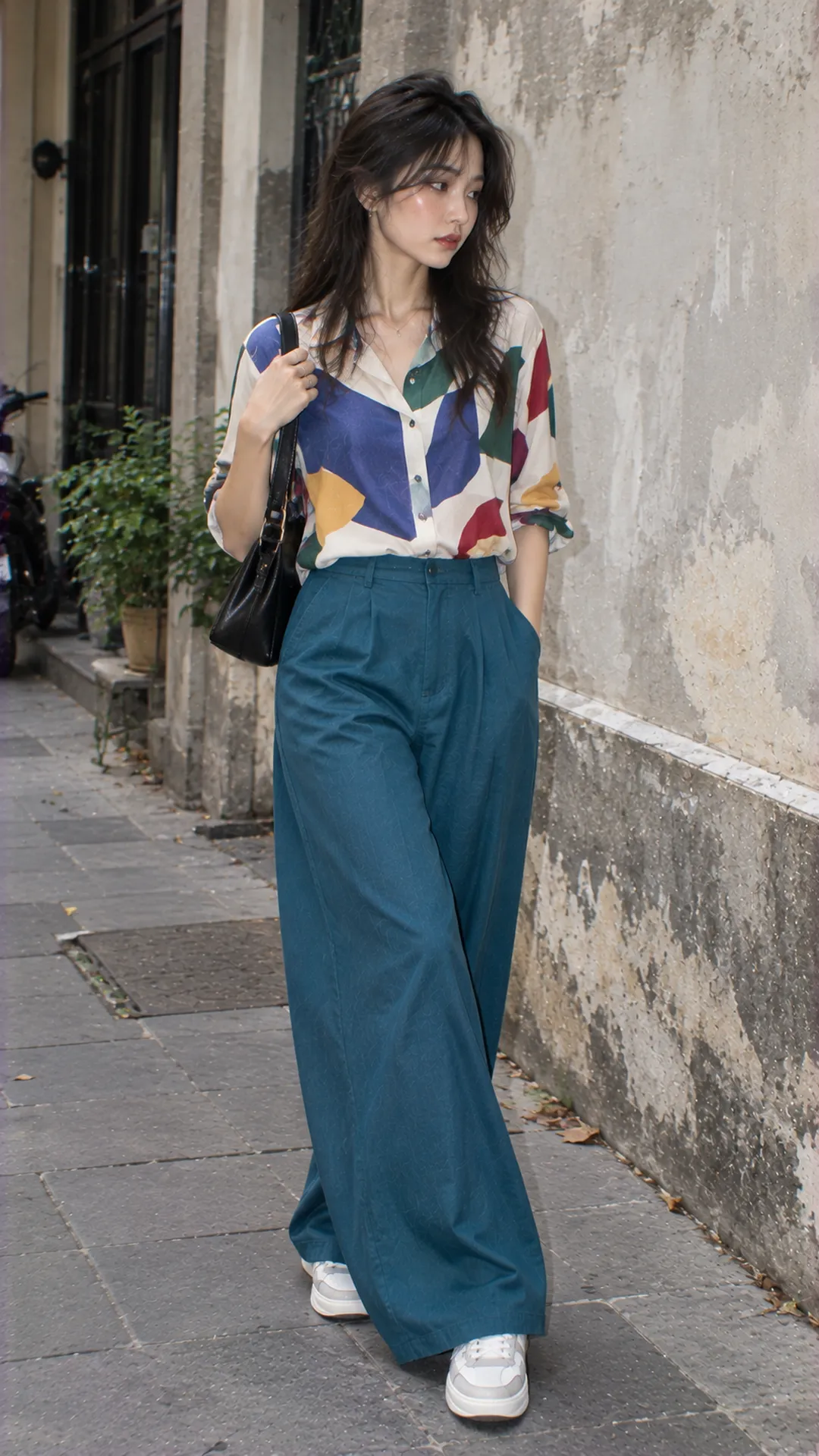
What is color blocking in clothing?
Color blocking organizes distinct areas on a garment or between pieces. A strong solid top with differently colored trousers can create it. It is not exclusively complementary: areas may be analogous, contrasting or arranged for another design purpose.
Try two minimally patterned pieces with visible color boundaries. Notice whether the dividing line falls at waist, hip or chest, affecting proportions. Change top length or tuck while retaining the same two colors.
A bright bag against a dark top also creates a clear color point, but its small area differs from two large clothing blocks. Start with an accessory and increase if desired. No degree of boldness is compulsory; choose what you want to wear again.
Neutrals and materials complete what the wheel cannot explain
Neutral black, white and gray need not be assigned hue positions on an RYB wheel. They can provide a base or light-dark contrast. Beige, brown and navy also commonly serve as wardrobe bases but retain color tendencies; compare the actual pieces rather than assuming equivalence.
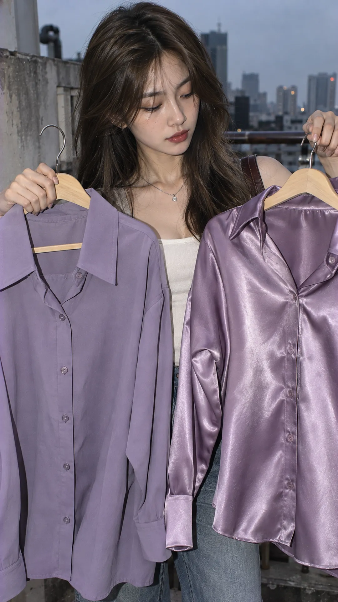
A glossy top reflects differently from matte fabric of the same named color. Near-identical product photographs can therefore look distinct together. For a coordinated set, request a photograph of both pieces together or try them in person if color matching is a priority.
Print changes color reading too. A black-ground skirt with sparse red flowers differs from one mostly covered by red flowers. Step back to identify the largest color area before selecting a partner. One small dot may not represent the whole.
Test a palette with existing clothes
- Choose a piece you want to wear and identify its main color and lightness.
- Choose a goal: continuity, gentle contrast or bold areas.
- Try one supporting piece using a suitable relationship before many accessories.
- Add shoes and bag to assess actual color proportions.
- Change one quality at a time: intensity, lightness or area, then compare.
Save the result as a fashion mood board connected to real outfits. Note what worked, such as a softer blue making the orange bag less harsh. Specific notes help more than saving an image labeled simply “good color combination.”
If using Adobe Color to explore relationships, treat the palette as a draft. Screen color does not guarantee fabric matching. Reduce intensity or select the closest existing shade, then reassess under the lighting where you usually dress.
How to fix three situations
Colors work on the palette but feel too bright when worn
Reduce one color's area, use a muted version or insert neutral space. Do not immediately change everything or you cannot identify the cause. Replacing a bright top with a small bag of that color can retain the original idea.
Many colors, but no focal point
Check items similar in intensity and size. Keep one prominent piece and quieten others. The main-piece approach in Alt Fashion outfits for beginners helps you decide without removing all color.
A beautiful palette unsuited to the outing
Color cannot replace function. An overheating jacket or difficult shoes still need changing. Compare with choosing outfits around your schedule and retain the palette through a more functional piece.
You need not memorize every formula before starting. Choose one item, test one relationship and observe how you feel wearing it. The wheel is most useful when it helps reuse clothes, understand why combinations work and adjust them next time.