

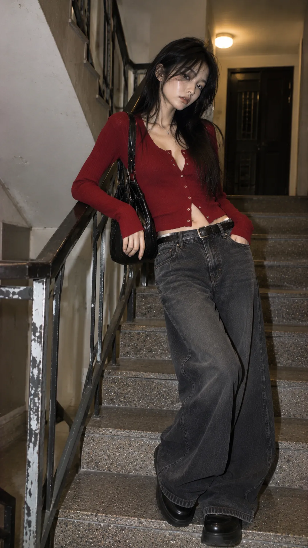
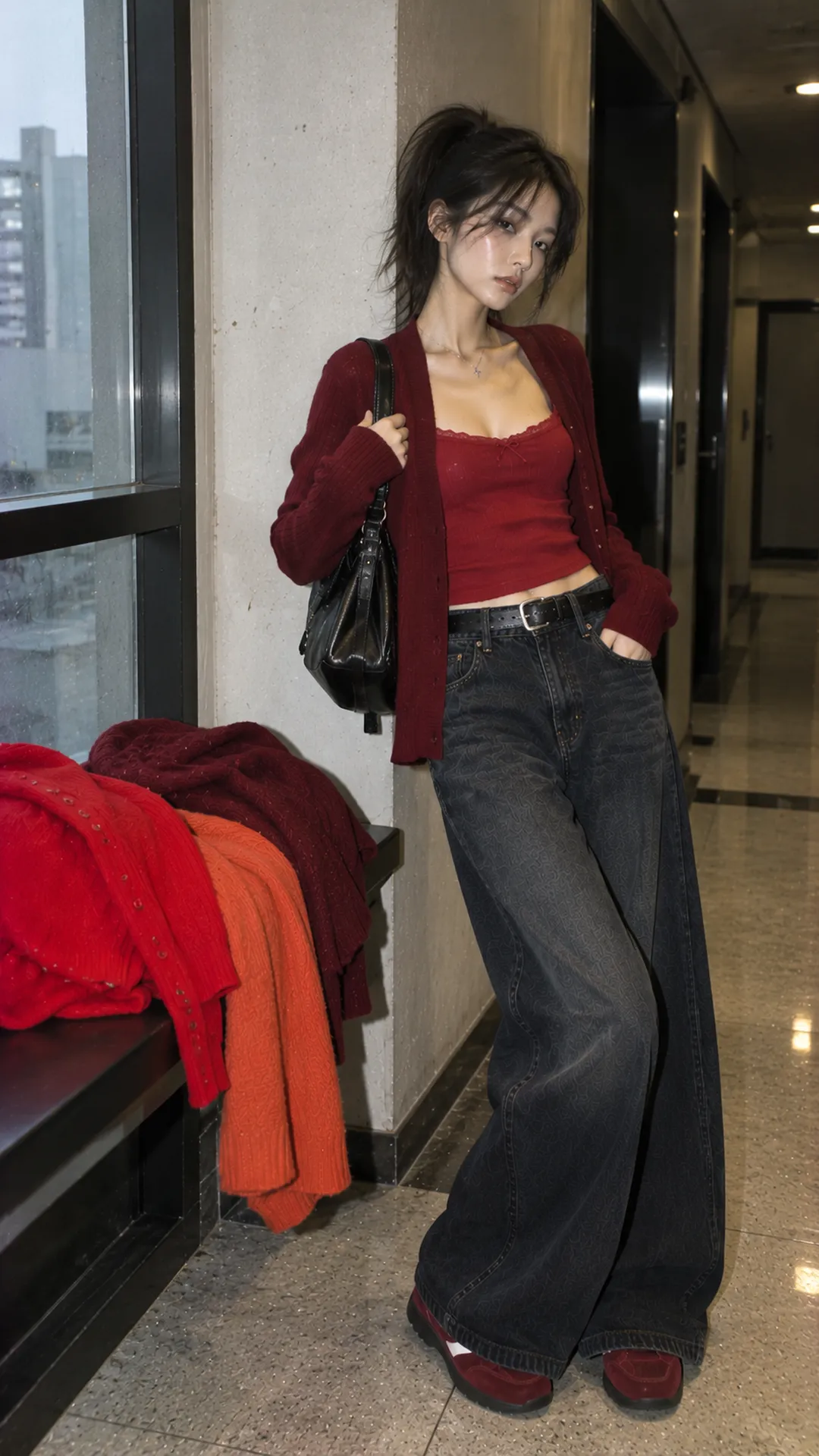
How do vivid, deep and orange-leaning reds differ?
Vivid red is usually strong enough to lead a neutral base. Burgundy or plum reds blend more closely with dark pieces; orange-leaning red differs beside cream, denim and brown. These guide rather than standardize every shop's palette.
Place red beside existing white, black and brown. If it appears very bright, start with a smaller area. If it nearly disappears into darkness, decide whether you want that effect; red need not be equally prominent in every outfit.
Surface changes color reading too. A glossy red bag may attract more attention than an equally sized matte scarf. Dress folds create lighter and darker reds. View several angles in real light rather than only a screen swatch.
Red with ivory and cream: create light space
Red and ivory form distinct areas. With red trousers, a plain white top lets the lower half lead. With a red dress, a cream bag or light shoes can lighten the look. Both are unnecessary if you want red to retain most area.
Cream is worth trying if bright white contrasts more strongly than expected. Deep red and cream retain richness with a clear highlight. Vivid red and cream work casually in simple cuts. Check how yellow the cream leans.
A red skirt, cream tee and ivory sneakers define color and length roles. With a wide flared skirt, use a waistband-length or tucked top. A loose untucked top is also possible; test with shoes to assess proportions beyond the color pair.
Red with gray and black: two strength levels
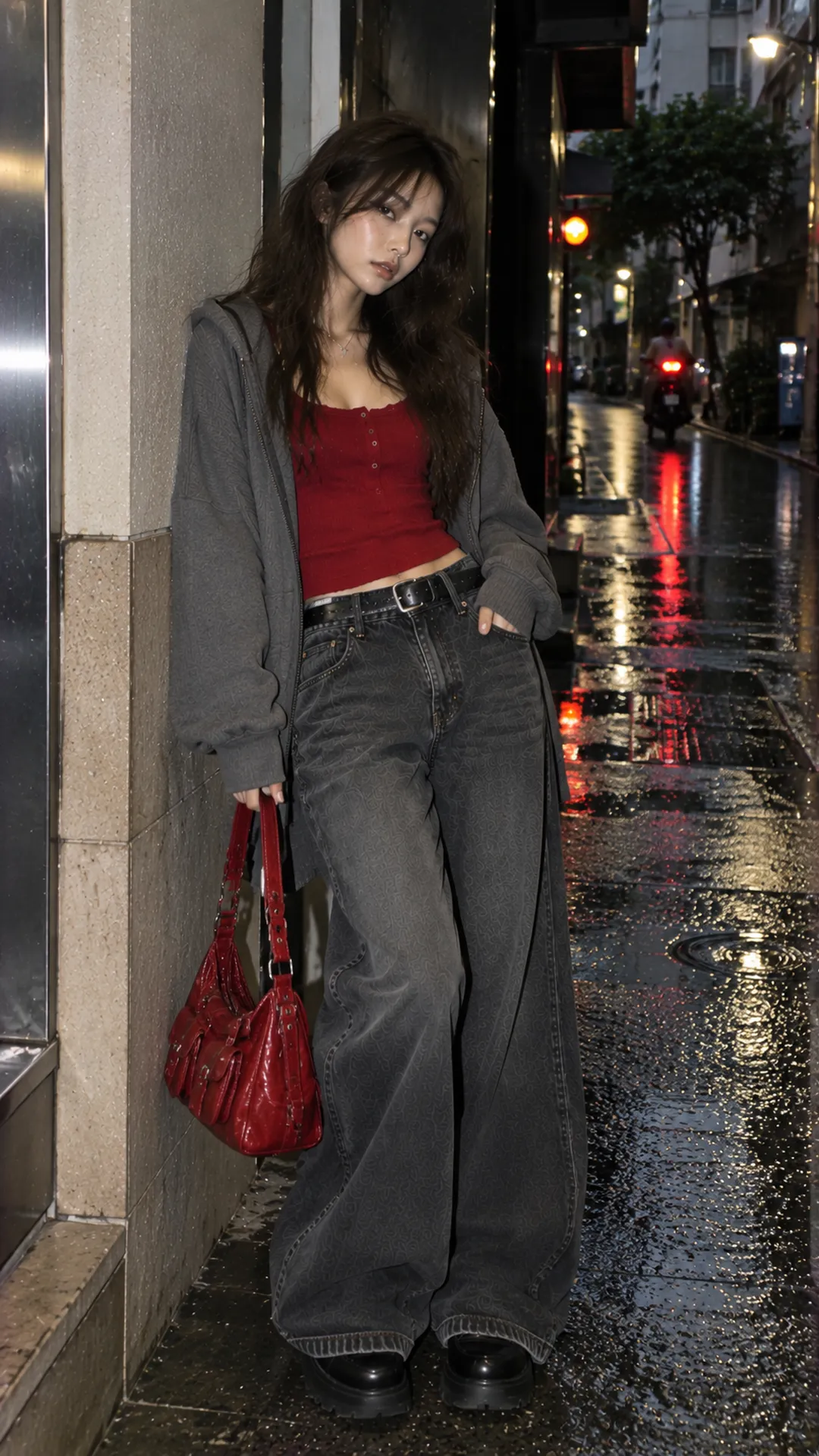
Gray gives red space to show
Light gray creates a gentler bright base than white; charcoal provides depth. A red bag with a gray top and dark trousers needs few wardrobe changes. Shoes need not repeat red. One area can lead while the rest stays simple.
With gray patterns, consider scale before adding red. Fine low-contrast checks differ from broad plaid. If pattern and red both compete, reduce one: use a small red accessory or plain gray.
Black defines a sharper boundary
Red and black contrast clearly, especially with bright red. For daily wear, choose one red piece over minimally detailed black. Black trousers, a plain top and red shoes already provide emphasis without a red bag, large necklace and many chains.
Burgundy can blend with black in dim rooms. Ribbing or a small fastener can separate them. For a more expressive direction, Alt Fashion styling for beginners checks cut and the main piece before adding accessories.
Red with denim and navy: work through depth
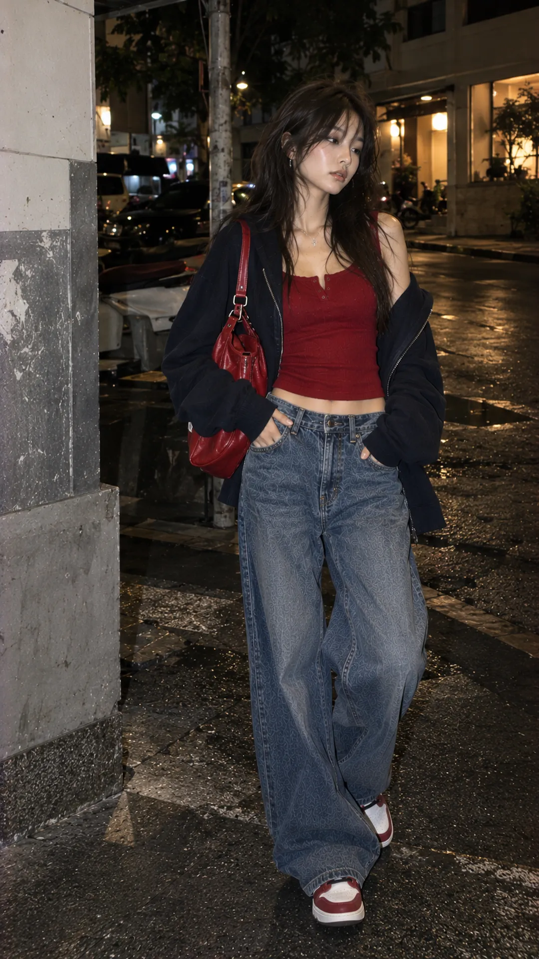
Blue denim provides a familiar base for red in several positions. A compact red jacket and medium jeans form clear areas; cream shoes finish lightly. With strong wash variation, reduce patterns on red to limit competition.
Switching from light to dark denim changes how red stands out. Keep the red piece and shoes fixed and change only trousers. This identifies the source more clearly than replacing everything simultaneously.
Navy and red can form a neat palette with simple cuts. To avoid sports-uniform or themed associations, do not simultaneously add broad stripes, badges and many symbols. Color alone does not define the aesthetic; those details specify it.
A navy base and red bag is a subtle option, with navy or black shoes. For more red, try a dress and weather-appropriate navy jacket. Check actual light: very deep navy may look black and differ from the reference.
Red with brown: a subdued base with an accent
Deep red and chocolate can create a rich overall palette. Separate through lightness or surface. Matte-brown trousers and a reflective burgundy bag distinguish more clearly than two equally dark, flat pieces.
Vivid red stands out more on light brown. Try a red scarf with cream and brown trousers or red shoes beneath beige. If disconnected, repeat a little red in an existing small detail without buying solely to complete a pair.
Brown bags and shoes need not match exactly. Check whether they compete with red. A large brown bag with many buckles may weigh more visually than expected. The guide to choosing expressive women's accessories rebalances placement and prominence.
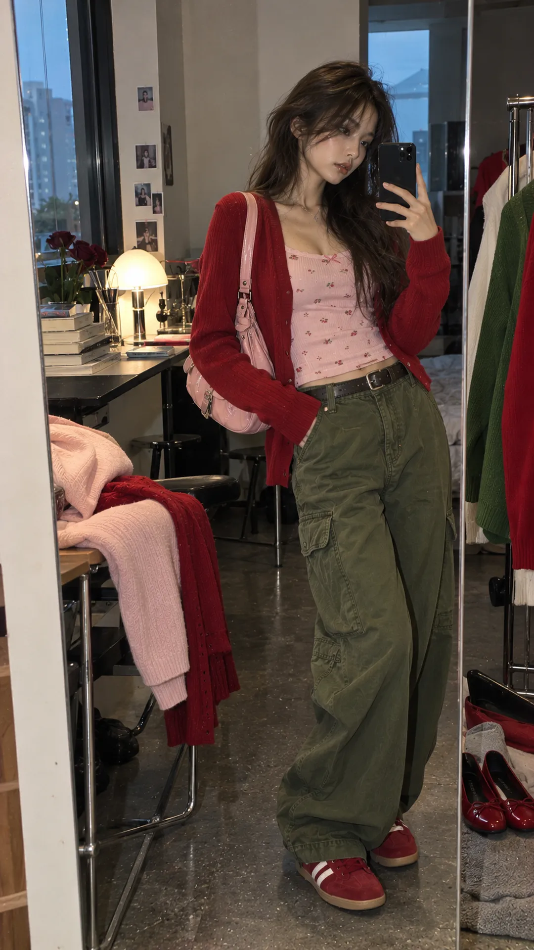
Combining red with pink or green
Pink can quietly support red when pale, or join it vividly for strong impact. If unfamiliar, try one pale-pink item and a red accessory. Check depth and intensity; a vivid supporting color may attract attention despite small area.
With green, olive or deep shades are easier starting points than equally bright large areas. Olive with an earthy-red bag differs from vivid red above bright-green trousers. The pairing is available; choose emphasis and avoid many themed details if festive associations are unwanted.
With two strong colors, start with clean cuts and low-pattern surfaces. Add accessories individually and observe their contribution. If removing one clarifies the outfit, it is not yet needed. No fixed percentage ratio applies to every garment type.
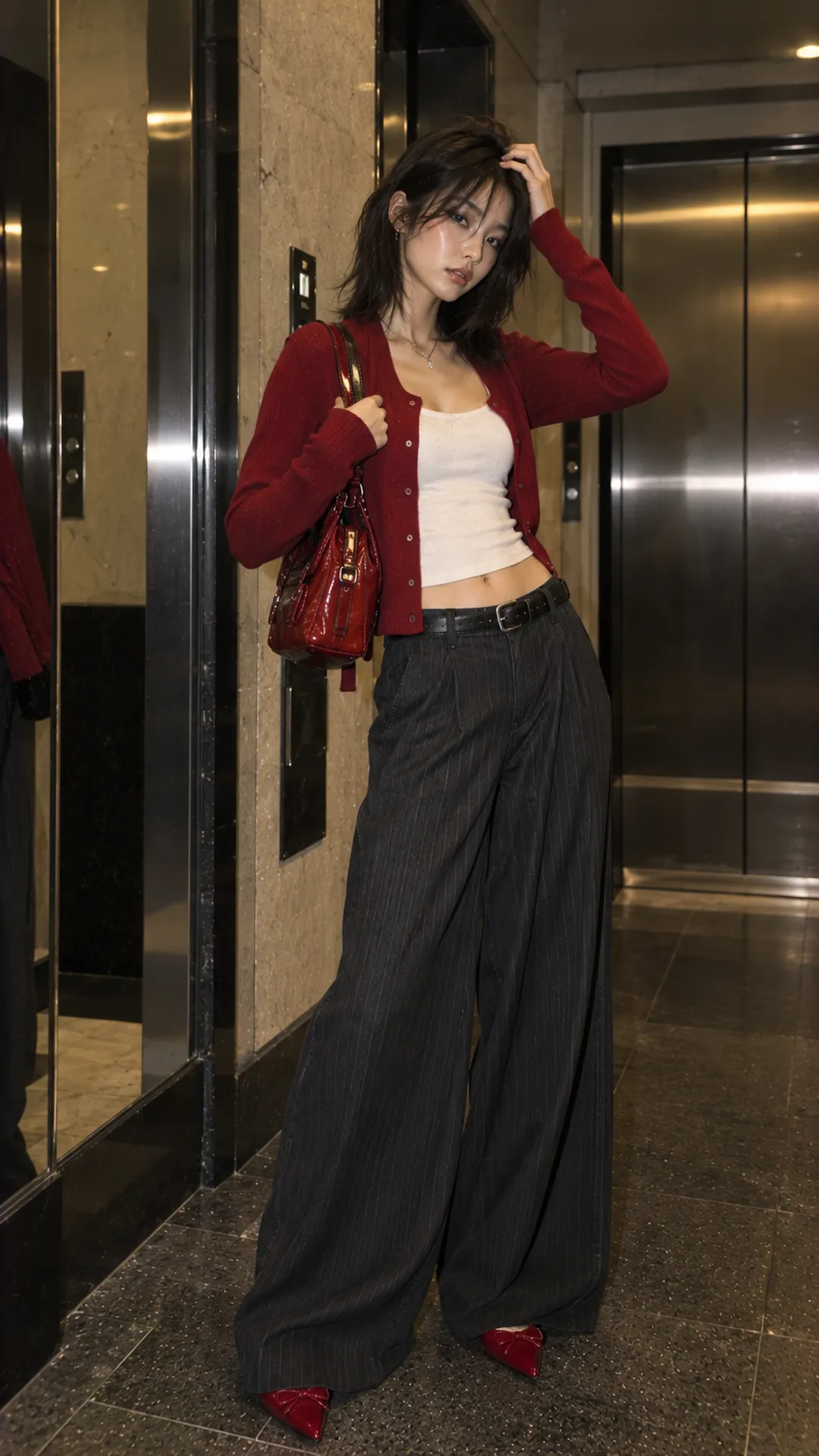
Where should red sit in the outfit?
A small area: shoes, bag, scarf or belt test red on an existing base. Choose your desired focal position. A bag in front may stand out more than one behind the hip; trouser hems determine how much red shoe shows.
A medium area: a red jacket, trousers or skirt needs balance elsewhere. Establish a neutral base before a third color. The base can be dark if you want stronger boundaries and contrast.
A large area: a dress or red outfit establishes most of the palette. Shoes, bag and outer layer should serve the occasion. With several reds, choose deliberate depth or material differences instead of approximate photo matching that disappoints in person.
Three adjustments for a red outfit that misses the mark
If too intense, reduce supporting-color area before abandoning red: replace a bright bag with a base color or remove a large pattern. If too dark, open a light area in an inner layer or accessory. If color works but the outfit is busy, review width, length and clustered details.
A loose red jacket and wide trousers may need clearer division rather than a color change. Conversely, neat shapes with many scattered red points can keep the eye moving. Retain one main focus and reassess whether repetition elsewhere is necessary.
Shoes shape the final effect. Neat footwear gives a strong palette a different feel from heavy-soled boots. The footwear-by-outfit guide addresses weight and hem gaps before you conclude the palette needs replacing.
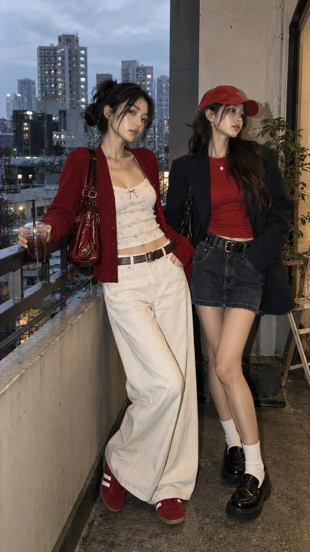
Build two reusable red formulas
Try one red item against a light and a subdued base. Keep shoes fixed at first, photograph full-length and compare. Record why you prefer one: clearer red, better proportions or lifestyle suitability. Specific notes speed future styling.
Save references with a shade and item type close to your clothes. Creating a fashion moodboard separates color, shape and surface into usable choices. A useful red palette can be adjusted from what you own rather than remain a long list of untested pairs.